Tuesday 25 May 2010
Monday 24 May 2010
New Photographs of Final Products
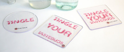
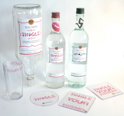
Due to my photography I re took my products in more of a natural light so I wouldnt get to much of a glare shining off the bottles which I was getting when using studio lighting. Here is the outcome.
Monday 17 May 2010
Crit 13/05/10
So like I said on the Ted Baker blog I didn't get much from the crit apart from knowing how to expand my briefs furthur. So with the Bacardi brief I thought about designing another two labels for two smaller bottles to show that I have designed for a range of drink bottles but with the time scale that I have and expanding my other briefs and getting them up to a quality standard I don't think this will be possible to do.
White Matt Sticker Bottle Labels
I have re done the labels so that they are on matt sticker paper, I think this looks alot better and my designs dont get lost. I have also re shot my photographs using studio lighting but the reflection of the bottles have really shown in my photos. I think this is because of the lighting used so I need to re take these maybe in more of a natural light.
Transparent Drink Labels in Context
So my whole idea of having all my products transparent to look as though its kiss marks on glass this is the message I was trying to give well...from looking at these photographs and putting my products into context the labels and designs completely got lost with the vibrant colours and competition going on from the other bottles in the bar. I need to consider this and develop from this to make my designs have more vibrance and colour in them then the transparent labels that I have used. So I will go back and re evaluate this and look at what I can do to develop this.
Thursday 6 May 2010
Labels for Neck of the Bottle
I wasen't sure whether to have a label for the neck of the bottle but then seeing it without makes the rest of the bottle look quite bland so here are a few different designs that I have done showing different colour variations using the logo and others using a letter taken from the typefaces that I have used. In my opinion I just like the letters on their own as it's not to overpowering and now diverting the attention to the neck of the bottle.
Wednesday 5 May 2010
Final Designs of Bottle Labels - Optrex
Here are the designs for the Optrex bottle label this is the bottle that is situated at the back of the bar either upside down in a holder or placed on a shelf. This label is bigger then the other two but basically I want it to be taken from the same design from the other two bottle labels but be made bigger.
Optrex Bottle Label
Optrex Bottle Label
Tuesday 4 May 2010
Design Development of Bottle Labels
Here are a few different ideas for the bottle label. I am wanting to create two different ones with two different flavours using both typefaces the leg and lip typeface. I have experimented with different formats, size of type, colour and layout. I want something that is simple but not to simple that its going to look cheap, something that is clear and gets the message of what I am trying to give of flirtatious.
Subscribe to:
Posts (Atom)


