Thursday 3 June 2010
Wednesday 2 June 2010
In Context
I also went on to create the design of my posters in to large scale billboards. So my designs work well on a smaller and a larger scale.
Poster on Mirror in Context
I also created the same design of poster but as a transparent adhesive poster so that it can be situated in toilets to act as another advertising feature. The reason for doing this because I am promoting this product in a bar or night club a lot of people go in to the toilets and sometimes queue for a long time and the mirrors get used a lot so I thought if I was to make a poster to be created for a mirror this would be a good way of advertising.


Tuesday 1 June 2010
Typography Book
Half way through this brief I wanted to do something with the all the typefaces that I made so they wouldn't go to waste but I didn't think I would have enough time to present them some how, but I did. I have created an A5 booklet of all the typefaces I have created explaining how I went about designing it etc. I have also processed the document into Issuu where you read it as a book.


Tuesday 25 May 2010
Monday 24 May 2010
New Photographs of Final Products
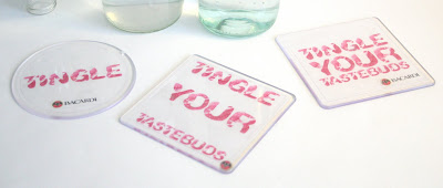
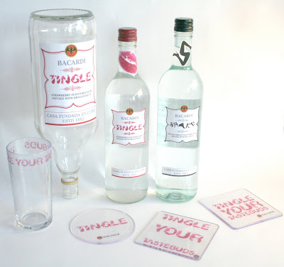
Due to my photography I re took my products in more of a natural light so I wouldnt get to much of a glare shining off the bottles which I was getting when using studio lighting. Here is the outcome.
Monday 17 May 2010
Crit 13/05/10
So like I said on the Ted Baker blog I didn't get much from the crit apart from knowing how to expand my briefs furthur. So with the Bacardi brief I thought about designing another two labels for two smaller bottles to show that I have designed for a range of drink bottles but with the time scale that I have and expanding my other briefs and getting them up to a quality standard I don't think this will be possible to do.
White Matt Sticker Bottle Labels
I have re done the labels so that they are on matt sticker paper, I think this looks alot better and my designs dont get lost. I have also re shot my photographs using studio lighting but the reflection of the bottles have really shown in my photos. I think this is because of the lighting used so I need to re take these maybe in more of a natural light.
Transparent Drink Labels in Context
So my whole idea of having all my products transparent to look as though its kiss marks on glass this is the message I was trying to give well...from looking at these photographs and putting my products into context the labels and designs completely got lost with the vibrant colours and competition going on from the other bottles in the bar. I need to consider this and develop from this to make my designs have more vibrance and colour in them then the transparent labels that I have used. So I will go back and re evaluate this and look at what I can do to develop this.
Subscribe to:
Posts (Atom)


