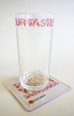
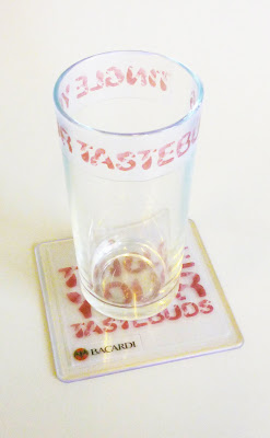
This is the final idea for the glass and drink mat transparent stickers, I need to re take the photograph on a better camera and also re consider re printing the drink mat stickers back to front to place them underneath the drink mat. So when you place the mat down on a surface the type is more vivid and clear as its pressed down on a surface revealing it more through the perspex.
Friday 30 April 2010
Preperation of glass stickers
Here is a few experiments of where the stickers could be placed on the glass bare in mind they will be transparent, I have printed them out on paper so I could see where they should and shouldn't be placed. I have done a few different layouts around he glass, inside the glass, top and bottom. I think I prefer having the message just clearly wrapped around the top of the glass because when people get given the glass they will be like 'Oh I've got lipstick on my glass' but when they look closer they will read the message and it will reveal that it is a promotion for Bacardi.
Design Development for Glass Stickers
Here are the designs for what I want to use for the glass stickers. I am going to print it out on paper first before I go ahead with the final to see what it looks like.
Tuesday 27 April 2010
Posters In Context
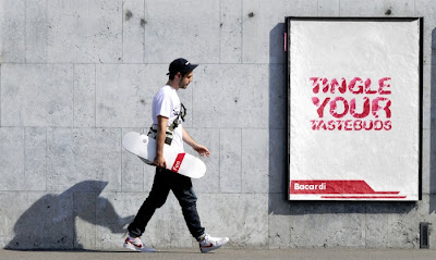
Here I have put my posters into context on bus panels and on the side of buildings where they would be situated in the real world. I have also created two web banners which show both typefaces and the same message which is on the poster.
Monday 26 April 2010
Experimentation with Embossing
For my beer mats I had two ideas that I wanted to experiment with one being embossing to demonstrate the whole theme of flirtatious and touch the other being transparent so the lip marks look like they are on glass.
I went down to digital print and experimented with sticker paper and the matt laminator to get a embossed feel using the message 'shake it' I did this process instead of embossing downstairs in screen print because I thought it would be a quicker and easier. It has given me a good effect but it doesn't have a strong enough embossed feel. I am also not keen on the large white space around the lettering I think this would be better if it was black.
So from this I have not decided to actually try the process of embossing downstairs in screen print to compare the two so I have lazer cut the typeface and I am going to emboss on to thin brown card.
The other idea that I had was the transparent look of using transparent sticker paper on perspex clear beer mats.
I think this idea works really well and would work well as a set with the clear lip marks put on a glass and a clear transparent poster on a mirror in a club or bar toilets so when you see the beer mat on the bar you will recognise the brand from it being on the glass and from the posters.
As well as using an emboss effect using the matt laminator, I tried out the lazer cutter using the cut kiss effect again to demonstrate the flirtatious theme and touch, so on the matt the letters are risen so the message could only be seen properly if your run your hand over the letters.
In my opinion I don't think this works well to show off its appearance, its just the outline of the letters and doesn't look particularly visually appealing.
Tuesday 20 April 2010
Tuesday 6 April 2010
Design Development
So from the crit I got feedback on my posters and they said about changing the with into a serif or a sans serif font because they thought using the leg type for the whole message looks a bit to much and that I needed to merge the type together so they didnt overlap each other. In my opinion I liked it the way it was but I thought I would take their opinions into consideration and see what it would look like, on the other hand I do agree I need to stop the overlapping off the legs so I will be merging these together to be as one.
I don't think I like changing the with to a serif or a sans serif font it makes it look out of place and not part of the rest of the text or message. It distracts you away from everything else on the page.

I don't think I like changing the with to a serif or a sans serif font it makes it look out of place and not part of the rest of the text or message. It distracts you away from everything else on the page.

Feedback and Progress
From the feedback I got from the crit I found that I needed to touch up the letters on the 'Shake it' poster to make a more formed letter. The type face made out of lipmarks seems to work quite strongly and is more readable.
What was also mentioned is that the neon legs overlapping each other looks really good but a little messy due to the shapes not all joining together so I need to look at this to join these together to mimic neon bulbs and simplify it a bit more.
Another suggestion was that I could look at doing a simple animation with the shake it design where it could be used as a TV ad or an online ad.
Subscribe to:
Posts (Atom)


